Creating a Personal Identity
I think this is one of the hardest things you can do as a designer. As part of my course, I had to come up with an identity that was personal, representative, reflective of what I was going to do with it, and versatile. I went through many different ideas and iterations of ideas, before deciding I would just go with something fun.
It's a choice to try and create something that will make some people smile, while knowing some other people might think it looks unprofessional or childish. I guess when I start applying for jobs I'm spinning the wheel on whether or not a company will like this. But maybe I shouldn't be so worried about it - maybe if they don't like it then I wouldn't be a good fit anyway.
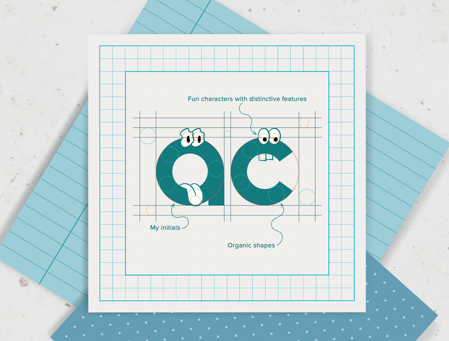
I decide early on that I will create an identity based on my name. I have a company called Raspberry Moose, but I'd tried to brand that some time ago and failed to come up with anything very good(!!), so my name it is. It's quite distinctive, I suppose that's promising. Eventually, I think the only way to create something simple with my name is to use my initials. AC, that's ok, I can do something with that.
But what to do? Do I go with a pointy A and a rounded C, or round them both and use lowercase letters? Do I make them big and puffy, or scripty and elegant? If I want to make them fun, how do I do that without being too silly?
And so my characters are born. They are lowercase, rounded and modern, based on complimentary-sized circles. The stem of the A took some modifying to eventually get it looking good, and not looking like a Q. They have distinctive cartoon eyes and mouth features that give each of them its own little personality. I can put them in different situations and have them interact with other design elements.
I love the colour teal, and I choose this to be my main colour for the logo. But, in keeping with the fun and slightly child-like nature of my identity, I also add other colours to the palette so I can create different features. When I come to my portfolio, I can make it bright and fun without being too distracting or stupid.
Much ideation, questioning, refining, worrying, and soul searching later I look at my finished identity. It's great for now, I think. After all, part of being a designer is to be constantly evolving, and there's no reason why my personal identity should be an exception to that rule is there?